Project Background
HSBC would like to deliver a support experience that customers find easy to use and is able to resolve queries and self serve using HSBC App.

The Problem
HSBC wants to be able to reduce the number of unnecessary calls to the call centre post implementing this design. They want an increase in NPS also as a result.
There’s currently FAQs (Help Topics) in the app – the busines has a view that this is underutilised and needs to be organized in an intuitive way.
The redesign should align with customer lifecycle management supporting customers in various stages
Timeline
4 months
Team
Product Design Manager
Mobile Platform Lead
Product Designer
Product Manager
Key Goals
Increase NPS
Reduce Support Calls
High Usage rates for
FAQs
My Role
I worked as a product designer and was involved right from the stakeholder requirement meetings to planning research and co-ordinating qualitative research interviews with research agency Bunnyfoot to Ideation and finally usability tests across HK and UK markets.
Throughout this project I was well mentored by my Manager Carrie Huang who trusted me with huge responsibility.
Design Process
The design process with this product was quite back and forth types. As there’s no linear progression due to the nature of users coming for help, it was quite involved. However, as typically in any projects we followed somewhat into design thinking methodologies.

User Research
We started with looking analytics reports and some meetings with stakeholders to understand project requirement and existing data that we had. Based on that we created a research plan that included recruiting participants against set criterias and then sending in screener surveys to filter our actual userbase. We then conducted interviews with 6 shortlisted participants.
Research agency Bunnyfoot helped us orchestrate the research.
Finally, after the final design we did usability testing in two markets namely HK and UK.
Competitor Analysis
During our interview sessions we also showed competitors screen and gave our users some task to observe how would they go about solving it.
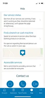
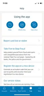
Barclays
People preferred Barclays page because of how the information was laid out and being able to contact the bank directly with Chat, Call or Video
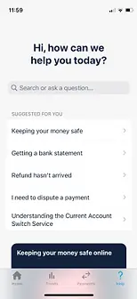
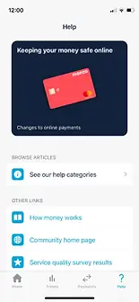
Monzo
People preferred search section of MONZO but were unsure if “Suggested for you” was personalised and none complained about phone no. missing.
First Direct
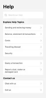
Almost all participant preferred th FIRST Direct help when compared to others mainly because of
“Search Bar” on top
Insights
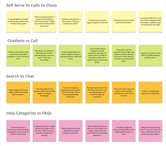
Data gathered from combined user interviews, competitor analysis and surveys revealed following insights.
- Users are highly likely to try to find the answer themselves first. However, only two thirds of users are successful in actually finding the answers
- When looking for help, users are most likely to search for the answers themselves or use chat
- Phoning the bank directly or using chat are seen as the most successful channels in resolving issues
- Greatest frustrations with chat is an automated response without any human interactions.
- Search bar was used by users when looking for answers they needed
- For large payment over $10,000 users would prefer chat rather than search bar
Artefacts
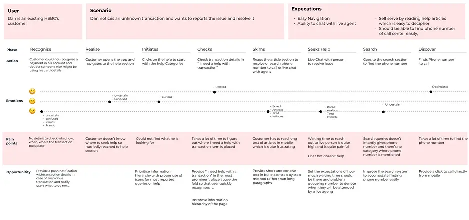
I created role based personas and customer journey maps for a scenario to help us better visualise the end to end process and get a fair direction forward.
Ideation
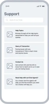
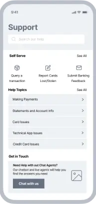
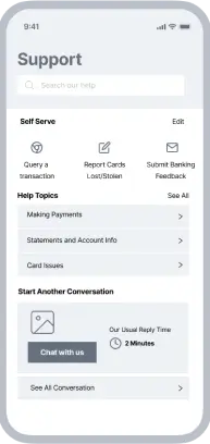
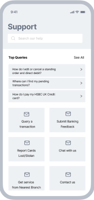
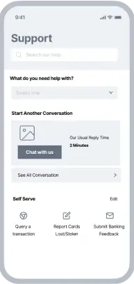
Final Screen
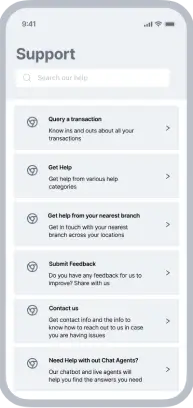
We had a combined session and reached a consensus on the final version which went through several iterations.

Usability Check
We conducted thorough user testing across UK and HK markets. We came to realise that search feature went un-noticed. Except, for one user who used search to perform a task others didn’t notice the search feature
All other features were taken cognisance of and used by our user to complete task
Measuring Results
Subjective Impression/Perceived ease of use
- Increase NPS
- Increased CSAT
Individual Feature
- Search Feature: Success Result Ration
- Help Content: Increased usefulness rating of help contents
- Chat: Increased “Problem Resolved” Ratio
- Find a branch - NPS
- What’s New - Average Session Length